Hello You
Last week, we gave you an impossible task, and we knew that you weren’t going to love it.
But who are we if we don’t present you with stuff you like and stuff you don’t?
As suspected, the biggest response was a no with - I will never ever do this.
We don’t blame you. It was a struggle, but ultimately it worked.
This week? Color and sound.
Grab Your Crayons →
SongsBrew Editorial
Note: For continuity, we’re using colour(s), not color, in this article, to keep with the name of the workshop. And, down at the bottom of the article, you’ll find Warner’s tracklist for the evening, plus a link to their Colour Cues collection of playlists. And find out what was in the bathroom stall.
Colours and Sound

Sometimes, we put down our headphones and head out into the world to do stuff. All in the name of research, and nothing to do with the epic goodie bag, open bar, and free snacks. (We’re writing this in a new Muse t-shirt.)
The opportunity to get inside Warner Chappell Music Benelux and Massive Music in one night? Unmissable.
Aside from the enjoyment of being in a studio watching production in action with Massive Music, or checking out the vinyl-stacked shelves, we were there to check out the Colour Cues Workshop.
Why? Because exploring the impact that music has on us is interesting. To be in a room with other people and see it in action, and the similarities and differences between who chose what was brilliant. But more importantly, sitting in front of an expert in sync, hearing it firsthand, gives it more weight and context.
So what was is/are colour cues? Well, “Colour Cues is an exploration in to the relationship between: colour, mood and sound” by Warner Music Group.
In the activity, there was a room full of music lovers sitting around a table. The facilitator played different tracks (a full playlist of the included tracks will be at the end of the article), and we had to pick colored pencils based on the music and put pencil to paper.

A short intro playing one of the most memorable ads ever, and a great example of using colour and sound to create emotion, came up on screen before we got started.
Would you believe this was 15 years ago? It is still an attention grabber, and it is the combination of the music and the colours that does it. It would be difficult to be anything but engaged after an opening like that.
In front of us sat a booklet, created by those who use colour and sound for much bigger purposes than we do in our everyday life. You might think of them as the people who pull the heartstrings; they understand the psychology of music and colour and how to use it (but are still creating and exploring it).
On each page was a song title and an artist's name. All we had to do was listen to the music and colour in. Letting the first few notes hit you, wash over you, and then see what comes up. While there were some outliers for each song, the majority of people chose the same tones.
The point wasn’t to start overthinking and choose what you thought you should, but rather just see what came to you. Rather than talking about it, we were communicating through colours and feelings straight onto the paper.
After each song, we talked about our choices and why we had felt that colour was right. Why had people picked reds and purples for Cardi B’s I Like It? Why had 90% of people picked black (one had added red for the flames of 90’s music) for Blur - Song 2, while someone else had picked a bubble-gum pink? (That one was us, we’re the ones with the pink.)
It would’ve been easy for us all to look around the table and either go with the majority or be contrarian with our choices, but that didn’t happen. People were very into the experiment. Carefully selecting, moving their hands as the music changed tempo (which was another interesting aspect of it all).
The easy way to describe it is that we were letting the music speak through us - as odd as that sounds, but that was the point. To let each twang of the bass, or electro beat, make its way from your ears out through your hands.
And while you might not have the booklet, you can still do the exercise, which is what makes it so cool. In some ways, it might help if you were less familiar with the music, because we assign feelings to music, which could cloud what you choose when you hear it again. In our case, I Like It was red because we loved the song and “spicy mama, hot tamales,” and knowing that lyric was coming up changed how we tackled the activity.
Here are the first tracks that we worked with, and the colors that were presented around the table (and we will include our own).
Express Yourself - Charles Wright: most people had greens. We had orange and sky blue, one person had a lot of bright picks, and coloured outside the lines in time with the music. Brown was also common for this one, and brown has a classic retro connotation.
adore u - Fred again: this one had a mixed reception, with some people reading it as a bit melancholy and going for deeper shades like dark blues. Some people described it as being outside and very nature-filled, but some had tinges of black. We had a mix here, sunset colors at the top, rolling into browns and blues, like a sunset on the water.
Song 2 - Blur: here, most people had black, with one person drawing the flames that were synonymous with a tattoo in that time period (Chester Bennington had them). We went for a bubble-gum pink, and that led to a discussion about how what you listen to regularly will position this song differently. If you listen to heavier music, Song 2 leans into pop, but if you never listen to anything in that vein, you’ll hear this as heavy. We also touched on the fact that they say in the song ‘when I feel heavy metal’ and how that can also change your perception. For us, the ‘woo-hoo’ sounds like bubble-gum pink.
I Like It Like That - Cardi B & J. Balvin: this one gathered a lot of reds, pinks, and yellows. And as mentioned earlier, we were no different here; we were solidly in the reds and oranges. One person went heavily and singularly into the pink, seeing the song as empowering, which then impacted the colour selection.
For the full playlist, click the Spotify image. You can do it at home by either closing your eyes, listening to the music and seeing what colours come to you, or use it as an excuse to grab some colouring pens and pencils and doodle on paper. So simple, and so fun.
Insider(ish) stuff
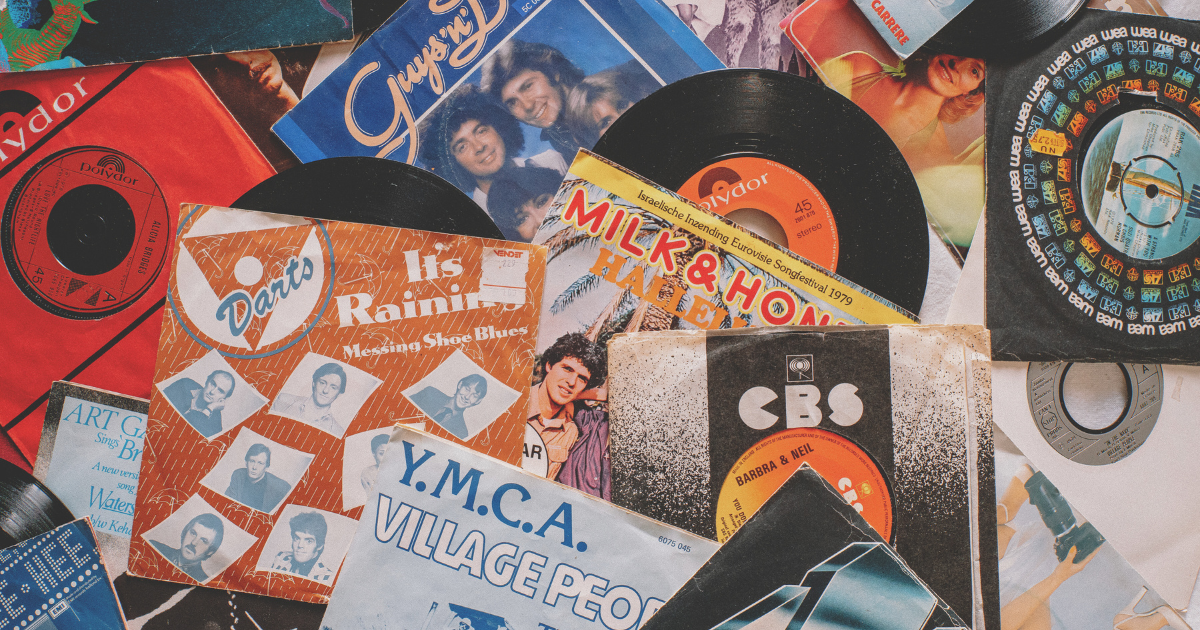
As promised, here is a look at the Warner Music tracklist for that evening (and they had a DJ you could hand a record to, from their own stacked shelves, naturally).

Titanium – David Guetta feat. Sia
Last Last – Burna Boy
Sugardaddy – Roxy Dekker
3D – Antoon
Lose Control – Teddy Swims
I Like It – Cardi B, Bad Bunny & J Balvin
Escapism. – RAYE
Marea (We’ve Lost Dancing) – Fred again.. x The Blessed Madonna
Where Have You Gone – Lucas & Steve
Feel Good Inc – Gorillaz
Seedy Tricks – Sylvie Kreusch
Not My Game – Lenny Monsou
Ze Is Pas Net Begonnen (Leerstage) – De Jeugd van Tegenwoordig
APT. – ROSÉ & Bruno Mars
Stumblin’ In – CYRIL
Dance The Night – Dua Lipa
Monaco – Jude York
Ik Zing – Zoë Livay, Snelle
Home – AVRYN, Trobi & Ayden
ZENLESS – Tiësto, Lucas & Steve, Silent Child
SOMEONE THAT YOU LOVE – Jarreau Vandal
HABIB – Boef: Slaaptekort
Workshop – Cho: Knock Knock 2
Want to take a deeper look at Colour Cues and access a bunch of colour and mood playlists from Warner Music Sync?
Of course, you do, so here is where you can find the hand-picked playlists: Colour, Mood, Music.
One of the images below was pinned on the inside of a bathroom door; you can guess which one.

A Final Note
“Color, which, like music, is a matter of vibrations, reaches what is most general and therefore most indefinable in nature: its inner power.” - Paul Gauguin.
If this got you thinking about music and emotion, the week we tested what crying and joy actually sound like is the one to read next.
And if you want to go deeper on active listening, here is the case for why it is worth the effort.
Until next time,


